![]()
German automaker BMW may be well known for the quality of its automobiles, but when it comes to logo designs, the company doesn’t exactly have the most prolific or creative track record. Now you’re probably thinking, what are you talking about? Hasn’t the BMW logo always been the same?! Well, the company has actually had five logos in its 103 year history, but you’d be hard pressed to notice seeing as all five of their logo’s look more or less the same.
![]()
That being said, the car maker has just introduced it’s sixth logo and it’s first redesign in over two decades. While it’s still undeniably the BMW logo, there are a few big changes that you’ll either love or hate. We try to break down the changes and decide if we’re digging it or not.
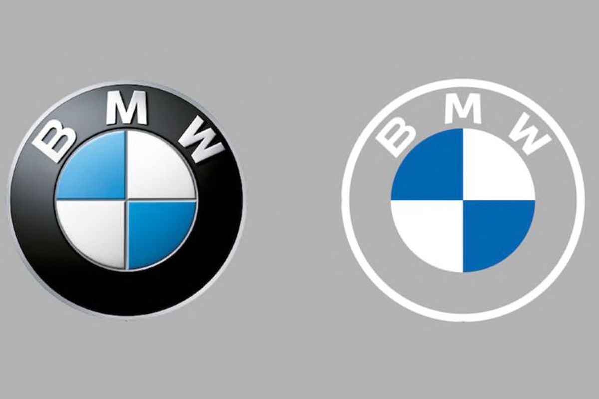
For starters, the whole logo is now flat. With it being 2020 and all, 3D effects are now very dated and the 3D effect of BMW’s previous logo had the 90s written all over it. Of course, you could argue that this 3D effect has become somewhat iconic. As iconic as it is, it’s a look that’s just too damn dated. So, kudos to whoever it was who made the decision to go 2D.
Next up, we have the change of font. Now, it’s barely noticeable but BMW’s flat new logo comes with a brand new font.. or rather.. the same font but with the space between the letters now being closer and more compact. Whatever it is, we’re digging it.
The third and most obvious change is that the outer ring of the logo is now transparent. This change in particular didn’t go down so well with The Verge, who argue that it makes no sense to make your logo harder to see, and it’s a fair point at that. If you look at the image above, the lack of a colour in the outer ring does make the logo look a little bland BUT slap that logo on a car and it actually doesn’t look bad. BMW are clearly going for a minimalistic look here and on it’s new i4 concept car, it works. Will it work on a white beemer? It actually just might.
All in all, we’re digging the new logo. It’s bold and looks great on the futuristic i4 concept. While we acknowledge that the white and transparent hues in the new logo will make it a lot more difficult to really properly see the logo in certain conditions, it’ll be interesting to see how BMW manoeuvres around this.
A spokesperson for the company has come out and said that there are “no plans” for the new logo to appear on production vehicles just yet but it’s only a matter of time I suppose.