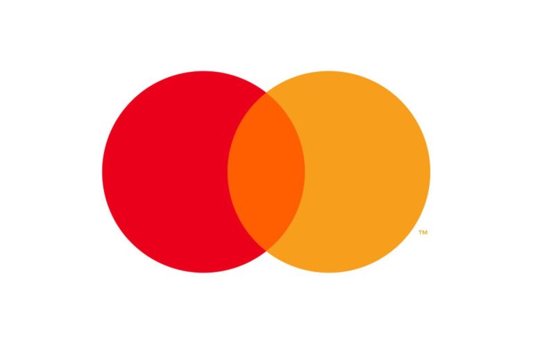

Mastercard is changing its logo. The red and yellow circles remain, but something is missing: the name.
Raja Rajamannar, the company’s chief marketing and communications officer, told the Wall Street Journal that Mastercard conducted nearly two years of research to make sure people could identify its wordless logo.
“Reinvention in the digital age calls for modern simplicity,” Rajamannar said in a statement announcing the change. “And with more than 80 per cent of people spontaneously recognising he Mastercard Symbol without the word ‘mastercard,’ we felt ready to take this next step into our brand evolution.”
Mastercard’s new, wordless logo suggests that the company is increasingly shifting its branding strategy in preparation for a credit card free world (yes, it’s digital payments).
By changing its logo, Mastercard is attempting to align itself with other iconic brands that are so well-known that they don’t need to be represented by words.
“Mastercard has had the great fortune of being represented by two interlocking circles, one red, one yellow, since its founding in 1977,” Michael Beirut, a partner at the design firm Pentagram, which designed the new logo, said in a statement. “Now, by allowing this symbol to shine on its own, Mastercard enters an elite cadre of brands that are represented not by name, but by symbol: an apple, a target, a swoosh.”
Mastercard isn’t the first company to drop the name from its logo in order to convey a shifting business strategy.
Starbucks dropped its name from its logo in 2011, some fans were not amused. The rebrand was about more than giving Starbucks cups a sleeker look — it was about expanding beyond the coffee business too.
“Even though we have always been, and always will be, a coffee company and retailer, it’s possible we’ll have other products with our name and no coffee in it,” Starbucks CEO Howard Schultz said at the time.
In an interview with the Wall Street Journal, Beirut said the new Mastercard logo not only suggests that the company is about more than just credit cards, but also looks better on small digital devices.
“You’re trying to optimize for a very small piece of real estate on a very small piece of glass,” he said. “It might not even be a mobile phone, it might be a watch face. Having to work in a 10-letter name in that is kind of a monster.”
He also said that the new Mastercard logo is easier to read on phones or digital watches. Cash(less) is the new king.