First Google become Alphabet now a new logo to complete the change. Over the 17 years of existence this would be the first time a major change on the iconic search logo has been worked on, the new identity according to google blog is to reflect the multi-screen use of the search engine nowadays be it on phones, TV, watch or even the dashboard of cars.
Designers at Mountain View have taken the Google logo and branding, which were originally built for a single desktop browser page, and updated them for the world of seamless computing across an endless number of devices and different kinds of inputs (such as tap, type and talk). The new logo has all the colours users have become accustomed with, same ones you find on the chrome logo, no fancy typography here, just plain fonts.
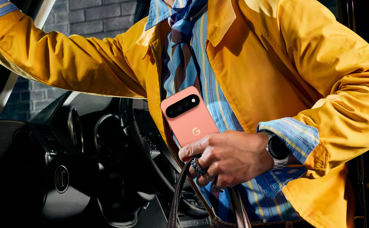
Apart from the simplicity, new elements have also been introduced like a colorful Google mic which will help you identify and interact with Google whether you’re talking, tapping or typing. There will also be no more little blue “g” icon and will be replaced with a four-color “G” that matches the logo.
This wouldnt be the last design change for sure, except to see Google roll out new designs for the rest of the products soon.